
The fundamental element of portal UX design determines whether a web portal will succeed under high traffic or will fail under stress. Any design choice needs to prove its effectiveness when thousands of users access your government services portal or your financial dashboard or your education platform or your logistics system at once. High traffic does not forgive weak choices. The system amplifies all mistakes.
A single pattern exists across different industry sectors which spans from financial dashboards in New York to education portals in India and public service platforms in Europe and logistics systems in Southeast Asia. Portals with thoughtful UX design grow stronger as traffic increases. Portals with careless design begin to fail exactly when they need to perform most.
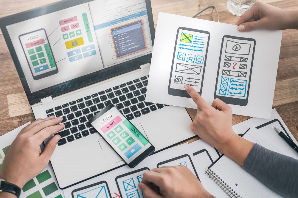
The blog presents 10 effective portal UX design methods which help your high-traffic web portal maintain its speed and simplicity while remaining user-friendly throughout your audience expansion.
1. Clarity Before Creativity

Your portal requires users to find their next destination immediately after they enter. The system needs to provide users with complete information. Users should find the system through basic links without needing to search. Users need to see their buttons because they need to understand how the system works.
The first thing people see in your portal needs to show them which of your system’s main actions they should take. Your first visitor needs to know which action he should take after his arrival.
2. Keep Navigation Simple and Consistent
The website requires its navigation system to maintain constant functions through its peak user periods. The visitors who make multiple visits to your portal will learn to navigate through the website. The users interact with the website elements through automatic clicking because they have full knowledge of the element locations.
The practice of relocating menu items and section names and layout changes without justification causes you to lose your established muscle memory. The system creates an experience for regular users which makes them feel like they just entered the website for the first time. The situation results in increased confusion which leads to more users seeking assistance.
An actual case demonstrates this point effectively. A large service portal in the Middle East redesigned its interface with a modern layout. The visual quality improved noticeably. The new layout caused menu items to shift their positions which resulted in a twofold increase in support requests within two weeks.
Users could not locate essential functions which they had utilized for several months. The lesson demonstrated that consistency represents the most powerful element in portal UX design. The process of establishing stable conditions creates a feeling of security which develops into customer loyalty.
The website needs assessment of navigation changes to determine their actual impact on user efficiency before any modifications occur.
3. Speed Is Part of the User Experience

People assume that UX design exists only to create visual elements and to design layouts and to develop interaction patterns. The statement only presents a partial view of the situation. Every portal project requires speed to function as a fundamental UX component from its initial design phase.
Server load experiences an increase when website visitors reach their highest numbers. Registration delays and product launch delays and financial year closing delays and peak service period delays will occur whenever designers fail to implement performance considerations during their design work.
Lightweight layouts establish better performance. The system achieves better performance through clean and efficient code. The system achieves better performance through the elimination of heavy graphics and unnecessary scripts. Users experience measurable advantages when websites use lazy loading images together with content delivery networks to deliver content across different geographic locations.
Picture yourself waiting in a lengthy bank queue. The entire experience becomes ruined when service operates at a slow pace although the building possesses architectural beauty. Speed establishes trust. Speed shows that the organization values the user’s time. A portal that loads in under two seconds will always outperform a visually richer portal that takes five.
4. Prioritize the Actions Users Need Most
High-traffic websites attract users from different backgrounds who need to complete their tasks. Users seek to obtain rapid information about their current status. Some need to download documents. Some users need to upload their invoices. Some users are applying for permits while others check their application results.
The design needs to show users all of the essential functions through direct access from the main interface. Users should find all functions through direct access without any clicking requirements. Users should access all functions through direct access without any requirement to navigate through dropdown menus.
The public services portal from Europe shows a real world example which proves the point. The team found through their analysis of user patterns that most users visited the portal to obtain a specific document. The website experienced a drop in complaints after the link moved to the homepage’s top section.
The portal homepage should function like a supermarket design which directs customer traffic. Supermarkets place their most popular products at the entrance while using clear signage to show their locations. Supermarkets store their rare products in the back of their stores. The same principle should apply to your online space. Your users will start their tasks from which point they should access the most important content on your website.
5. Reduce Cognitive Load

Cognitive load describes the amount of mental energy needed by users to move through your portal. Users in high-traffic situations need this concept because they visit sites with time constraints.
A student submitting exam registration forms. A supplier uploading compliance documents before a deadline. A citizen applying for a time-sensitive permit. Users who visit these sites require instant access because they do not want to spend time solving puzzles.
The extra five fields should be eliminated because the form requires only five essential fields. The instructions which currently require three paragraphs should be reduced to three sentences. Users need to see two buttons because they need to understand that these buttons perform different functions through their distinct visual designs.
Good portal UX design removes mental friction. The experience should feel smooth and intuitive like sliding a drawer open without resistance. Your platform provides users with time savings through automatic processes which lead to positive emotions.
6. Design for Mistakes
The system will experience errors when thousands of users access the portal throughout each day. The system will experience misuse because users will click the back button while their work remains unfinished. Users will submit the incorrect number and their results. Users will submit the incorrect file format which the system cannot accept.
The system needs to handle these situations with both gentle touch and clear communication. Error messages should be written in plain, human language that explains exactly what went wrong and what the user should do next. The system should remove all system messages which include “Error 422: Invalid payload” because they need to use simpler language. The system should display “It looks like the file format is not supported. Please upload a PDF or JPG file.”
A store assistant who handles customer requests with knowledge will not stop customers from entering a store because he wants to show them which section the product belongs to. Error handling is a crucial component that influences how users experience UX design throughout the entire portal. Users who receive smooth assistance during their errors will complete their work and come back again. Users who encounter system blocks without any assistance will abandon the system and seek help from support.
7. Mobile Experience Cannot Be an Afterthought

Users in India Indonesia Nigeria and Kenya use mobile phones as their primary method to access web portals. Mobile internet usage keeps rising throughout the United States and Western Europe because people prefer using mobile devices for browsing.
High-traffic portals require developers to create interfaces which maintain equal functionality between small screens and large desktop displays. Buttons must be large enough to tap accurately. Text must be readable without zooming. Forms must support automatic adjustments to different screen sizes. Users should be able to navigate the system through their keyboard and mouse.
Responsive design is not optional for high-traffic portals. It is a baseline expectation.
8. Use Visual Hierarchy to Guide Scanning

The most important information needs to be displayed through larger font sizes. The designer should use whitespace for section breaks which will help create clear visual boundaries. The designer should use color for essential functions by applying it in limited amounts to highlight main activities.
The designer needs to maintain a visual system that avoids visual distractions. The use of multiple colors leads to visual confusion. The multiple banners which track for user focus create visual disruption. The excessive number of pop-ups results in user dissatisfaction.
Imagine a newspaper front page which presents its content in an organized manner. The headlines create a strong visual impact. The supporting details follow a logical sequence. The reader can navigate the page because everything moves in a straightforward manner. Your portal should make users experience this feeling.
9. Stress Test for Peak Traffic Moments

Your training extends to information gathered until the month of October in the year 2023. The university admissions period and the deadline for tax submissions and festival sales and product introductions and government service hours create specific times when portal usage reaches its highest level.
The system experiences its most significant performance problems when users try to access its functions. The system freezes when users try to click buttons. The system freezes which prevents users from accessing the website. Users will see a loading spinner that never completes its task. The system shows users a portal that stops working during their most critical times.
High-traffic portals need to conduct stress tests after every major event. The design team needs to work with the development team to evaluate system performance during times of high user traffic. The interface enables users to perform essential functions with speed. The user interface design maintains its operating status while users interact with it.
The portal maintains its operational capability during peak times which resembles a traffic officer who handles heavy traffic disturbances. Users establish their trust in a system because of its ability to maintain operational reliability.
10. Make Accessibility a Foundation, Not a Feature

The UX design of the portal needs to provide users with font sizes that maintain readability without causing eye discomfort. Users should be able to read text through the design which creates strong contrast between text elements and background surfaces. Users who lack mouse abilities need access to keyboard navigation. Screen readers need to access alt text which provides description for images.
The government portal project in Southeast Asia achieved digital service accessibility for previously excluded users through the addition of regional language options which led to higher user satisfaction.
People view accessibility as a requirement that organizations should fulfill to show their dedication to public service. The system shows users that developers created the portal to serve their specific needs.
Final Thoughts
The purpose of Portal UX design implementation at large scale projects goes beyond crafting an attractive visual design but instead works to create an interface which enables users to finish their required tasks without facing any obstacles. The purpose of this system exists to help organizations which need to handle high user volume operations in their work process.
The strategies in this blog have been drawn from real portal projects across multiple industries and continents. The patterns they reveal are consistent regardless of geography or sector. The performance of every portal system which works successfully under pressure depends on three essential elements which include transparency and predictable system behavior and speedy service delivery and user-friendly accessibility and time efficiency and user time management.
Please contact us through our email address contactus@panalinks.com.