

What a UX optimization strategy means, and why teams often miss the point

A UX optimization strategy is a repeatable way to spot stuck points in a product. Then it guides teams to remove those issues with evidence from real users. A lot of teams fail because they treat UX like a single makeover. They design, launch, and then wait. A redesign may fix what looked wrong in a mock. A real optimization plan fixes what is actually wrong for the people who use the product. It also keeps going after release, with tests that confirm improvements.
In 2026, the big change is speed. Data capture and analysis tools are quicker to set up and less costly than before. That makes this kind of ongoing work possible for many teams, not only large companies with full research staffs.
Why data and AI change how teams think about UX
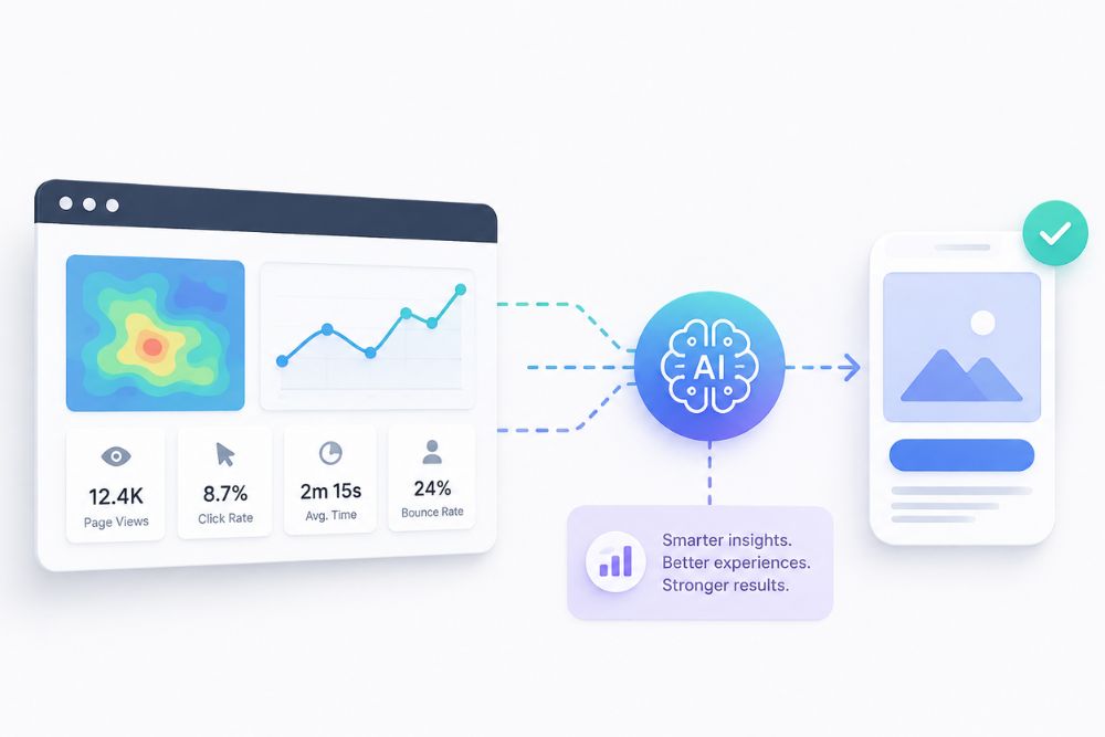
Old school UX work often leaned on surveys and rare usability sessions. It also leaned on what designers felt was best. That process can be slow. It can also drift toward the views of the team. Today, UX optimization is shaped by three parallel shifts:
- With behavioral data you can log every click and scroll. Even the odd moments like hesitation and rage taps get captured. Then the data can be reviewed without waiting weeks.
- Machine learning can spot patterns in that data. It finds spots where people get stuck. A human might miss those details at first, since they would need to review a lot of sessions.
- Personalization can change as the user moves. The page can fit a group user, or even one person. You do not have to rely on the same fixed layout for everyone.
So the UX plan can shift. It moves away from only reacting after users complain. It can also help you predict trouble earlier, before it hurts signups or sales.
9 Proven UX Optimization Strategy Tactics That Actually Work
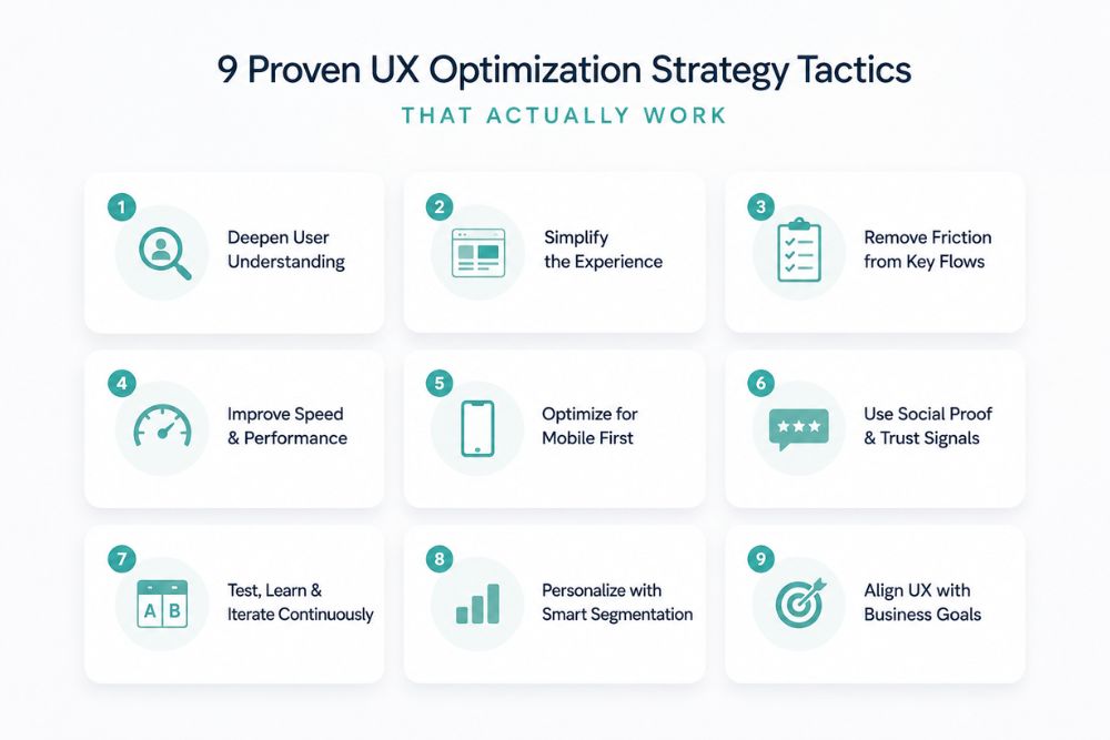
Here is a simple guide to nine tactics that show up in most UX work that performs well.
- Draw user journeys from behavior, not guesses
Start by tracking the real paths people take. Do not rely on what you think they should do from a site map. Event tracking and funnel data often show loops, dead ends, and places where people quit.
- Use heatmaps and replays that flag issues
Heatmap tools can highlight rage taps, clicks that do not do anything, and strange scroll behavior. They do not make you watch hours of replay video by hand. That means you can move fast and focus on the real fixes.
- Keep doing small A B tests all the time
Do not only run one huge redesign test. A good UX approach uses small tests on a steady schedule. Try one change at a time, like a headline, a button style, or a single form field. Good results stack up, and bad results cost less.
- Think of Core Web Vitals as a real user win, not a simple SEO box
Speed, stable layout, and quick responses matter because they shape how people feel at first click. If the page jumps while it loads or takes too long to react, it undermines other work you do.
- Use predictive signals to spot drop-offs early
Modern models can spot patterns that point to “likely to leave” while the person is still browsing. That gives you a chance to step in, with a chat prompt, a simpler form, or a calm reassurance note before the exit happens.
- Tailor the page with AI-based audience splits
Instead of showing one default view, you can split visitors by behavior and by where they came from. Then the page can adjust what shows up, how it is laid out, or which offer appears. Even basic split logic, like new vs returning visitors, can boost engagement.
- Reduce form and checkout pain by scoring friction
Give each field and each step in checkout a friction score. Track where things stall: fields that users skip, autofill trouble, and error messages that do not make sense. Fix the worst points first rather than rebuilding everything in one go.
- Add chat help and copilots where users hesitate
Place an AI assistant at key moments, such as pricing pages, checkout, and harder forms. When a person hesitates, the assistant can answer the exact question that would otherwise lead to a quiet exit. Support costs can shift into improved conversions.
- Measure UX with hard KPIs, not only gut feelings
A UX plan needs clear numbers: task success rate, time-on-task, System Usability Scale score, and error rate. If you only say “it feels better,” you end up with an opinion, not evidence.
How to Measure the ROI of Your UX Optimization Strategy
Connect each UX change to a business result. Do not rely on taste alone. A solid approach shows a UX metric and a business metric in the same view.
- Task success rate next to conversion rate
- Time-on-task next to checkout completion rate
- Rage-click rate next to support ticket volume
- Core Web Vitals next to bounce rate and organic rankings
If both sets of numbers move in the same direction after a fix, you can point to evidence. It is not just a guess. It means the update earned its spot.
5 UX optimization traps that hurt outcomes
- Redesigning everything in one go, not running one test at a time
- Using team opinions instead of watching real sessions
- Skipping mobile issues because desktop looks fine
- Calling one usability test “finished” and stopping there
- Chasing the look of the page instead of task completion
Ready to Build a UX Optimization Strategy That Converts?
You can build a UX optimization strategy that fits your product, your users, and your data. Not a copy-paste template. Our team at Panalinks can help with an audit, testing, and ongoing improvements to your digital experience.
Contact us at contactus@panalinks.com