
With the rapid growth of mobile browsing, mobile usability has become a critical factor in web design. Today, over 60% of global internet traffic comes from mobile devices, making it essential for businesses, eCommerce platforms, and service providers to offer a seamless, mobile-friendly user experience. Poor mobile usability can result in high bounce rates, low conversions, and lost revenue, while a well-optimized mobile experience can significantly increase online presence and sales.
For WordPress developers, Shopify eCommerce site designers, React Native app developers, and Laravel experts, creating a mobile-friendly experience is no longer optional—it’s a necessity. In this article, we’ll explore the best mobile usability practices that can help web designers build stunning, high-performing mobile websites.
1. Implement a Mobile-First Design Approach

A mobile-first approach ensures that designing for smaller screens is the top priority, rather than just an afterthought. By starting with mobile usability in mind, web designers can create layouts that are clean, intuitive, and user-friendly across all devices.
Best Practices for Mobile-First Design:
- Simplify Navigation – Avoid complex menus and provide easy-to-access navigation elements.
- Prioritize Essential Content – Keep only the most crucial elements visible, removing unnecessary clutter.
- Use Large Tap Targets – Buttons and links should be big enough for users to tap without frustration.
Example:
A Shopify eCommerce site designed with a mobile-first approach will feature clear product images, easy checkout buttons, and smooth navigation, resulting in higher conversions.
2. Optimize Website Speed and Performance

Speed is one of the most critical aspects of mobile usability. A slow website frustrates users and causes them to leave before engaging with content or making a purchase. Google also considers page speed as a ranking factor, meaning slow-loading sites can hurt SEO performance.
How to Improve Mobile Website Speed:
- Use Lightweight Themes and Code – Avoid heavy scripts and optimize CSS and JavaScript.
- Compress Images and Videos – Reduce file sizes without compromising quality.
- Enable Browser Caching – Store frequently accessed data to reduce loading times.
- Utilize Content Delivery Networks (CDNs) – Distribute content efficiently across multiple locations.
Example:
A React Native app development project benefits from optimized assets, ensuring that the app loads quickly, even on slower networks.
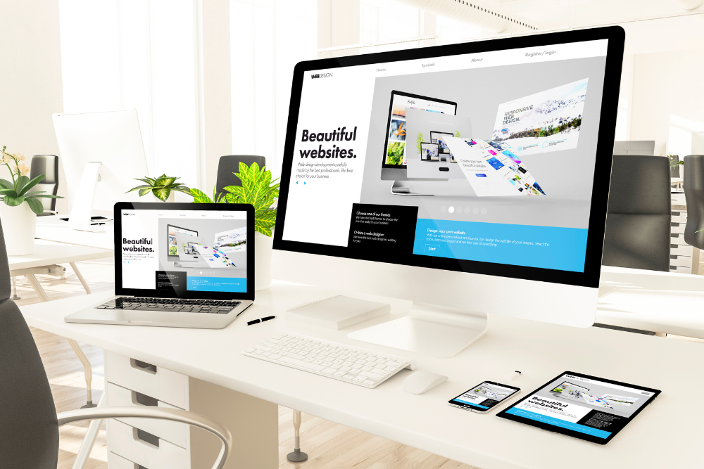
3. Use Responsive and Adaptive Design Techniques
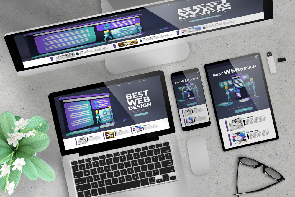
A responsive design ensures that a website adjusts automatically to different screen sizes using flexible grids and layouts. This means that whether a user is on a smartphone, tablet, or desktop, the content will look good and function smoothly.
Adaptive design, on the other hand, involves creating different layouts for different devices. Instead of a single design that resizes dynamically, adaptive design serves a pre-defined layout based on the user’s screen size. This can improve speed and performance, as mobile users get a layout specifically designed for their screen.
Both responsive and adaptive design have their advantages, and choosing between them depends on the project’s goals and technical requirements. For most websites, responsive design is the preferred approach because it ensures flexibility and ease of maintenance.
Example:
A Laravel-based eCommerce development project benefits from adaptive design by ensuring that desktop, tablet, and mobile users each receive a tailored, high-performance experience.
4. Ensure Touch-Friendly UI Elements

Since mobile devices rely on touchscreens, designing with tap, swipe, and gesture interactions in mind is essential. Users should easily interact with buttons, forms, and menus without frustration.
Touch-Friendly Design Tips:
- Use Large, Well-Spaced Buttons – Ensure tap targets are at least 48×48 pixels.
- Eliminate Hover-Dependent Features – Mobile devices don’t support hover effects like desktops.
- Avoid Tiny Text and Links – Font sizes should be readable without zooming.
Example:
A WordPress development project integrating touch-friendly buttons and swipe-based navigation improves user experience for mobile shoppers.
5. Simplify Forms for Better Mobile Conversions

Forms are crucial for sign-ups, purchases, and lead generation, but poorly designed forms can deter mobile users.
Best Practices for Mobile Forms:
- Keep Forms Short – Only ask for essential information.
- Use Autofill & Input Masks – Help users fill in fields quickly and accurately.
- Enable Click-to-Call & Click-to-Email – Make phone numbers and email addresses tappable for instant action.
Example:
A Shopify eCommerce checkout page with a one-page form and autofill features can significantly reduce cart abandonment rates.
6. Optimize for Mobile SEO and Voice Search

Mobile usability is closely tied to SEO performance. Google prioritizes mobile-friendly sites, and the rise of voice search means optimizing for conversational queries is now essential.
Mobile SEO & Voice Search Optimization:
- Use Mobile-Friendly Keywords – Focus on natural, conversational phrases people use in voice searches.
- Optimize for Local Search – Many mobile users look for nearby businesses—ensure your site is listed on Google My Business.
- Improve Readability – Use short paragraphs, bullet points, and clear headings to make content scannable.
Example:
A local business website built on WordPress with optimized mobile usability and voice search keywords will attract more organic traffic and local customers.
7. Test Mobile Usability Across Multiple Devices
Testing is the final step in ensuring a smooth mobile experience. Different devices have different screen sizes, operating systems, and browsers, so testing across multiple platforms is crucial.
How to Test Mobile Usability:
- Use Google’s Mobile-Friendly Test – Identify usability issues quickly.
- Test on Real Devices – Check performance on iPhones, Android phones, tablets, and more.
- Simulate Slow Networks – See how your site loads under 3G or 4G conditions.
Example:
A React Native app development project benefits from thorough cross-device testing to ensure a seamless experience across Android and iOS.
Final Thoughts
Mobile usability is the foundation of a successful website or app, directly impacting engagement, conversions, and search rankings. With more users accessing the web via smartphones, designing with mobile-first principles is crucial. Whether you’re building a WordPress development project, a Shopify eCommerce store, or a Laravel-powered application, ensuring speed, responsiveness, and usability will help you increase online presence and boost user satisfaction.
At Panalink Infotech, we specialize in mobile-friendly web development, eCommerce solutions, and app development. If you need a stunning, high-performance website that prioritizes mobile usability, our team is here to help!
Need expert help with mobile-friendly web design? Contact us today!