From the neon-lit streets of Seoul to the bustling, rain-drenched lanes of Mumbai, the web is never silent—it hums in a thousand languages, offering up everything from memes to medical guidance. Yet the difference between a universally welcoming digital door and one that creaks open only for the few is sharper than ever. Accessibility, once relegated to a checkbox or the bottom of a sprint list, is beginning to feel more like an art form—one that shapes the very heartbeat of web interaction for 2025 and beyond.
Peel back the layers, and you’ll find six remarkable strategies, each recalibrating how digital spaces invite, include, and empower. As you move through each, expect no textbook diagrams, but instead fresh approaches spun from lived experiences and concrete, inventive thinking.
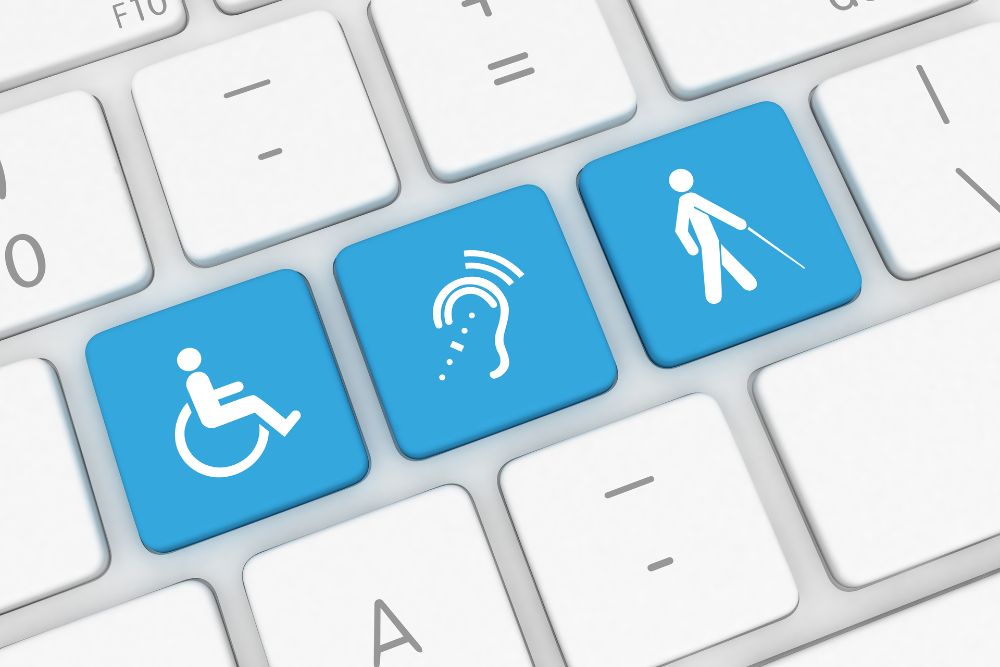
Top 6 Foolproof Ways to Boost Website Accessibility in 2025
Soundscapes, Not Just Silence: Audio Navigation Redefined
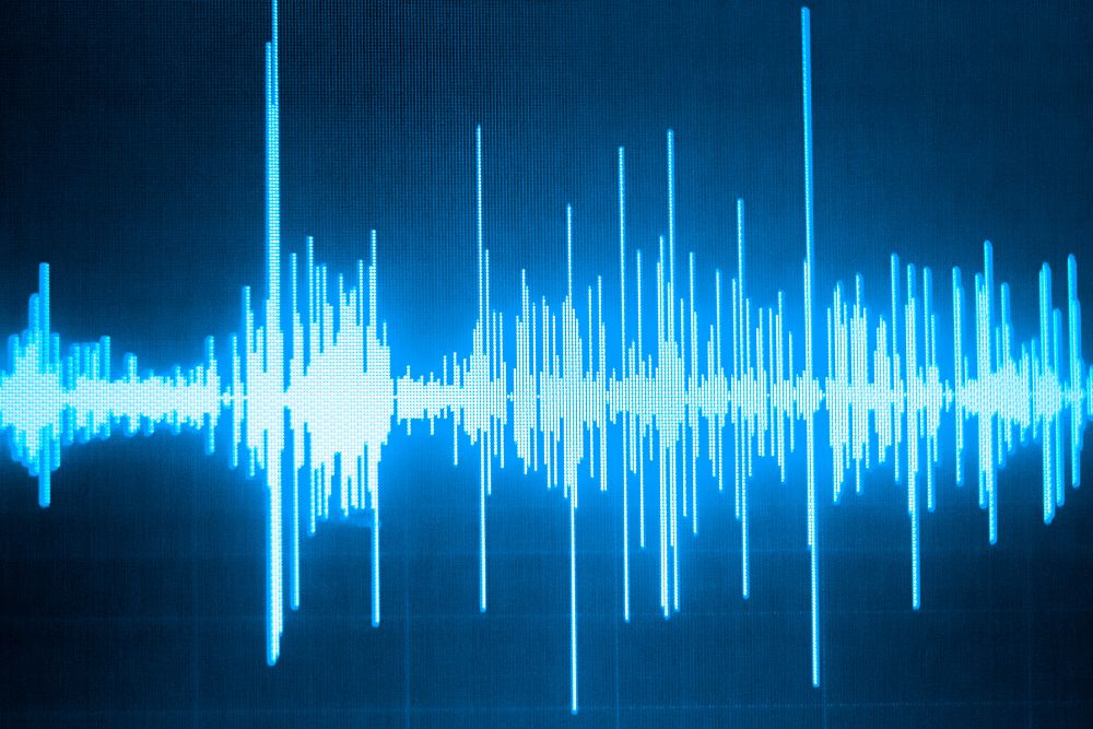
To many, the idea of web navigation still conjures up images of links and menus. Rethink that. Imagine a website where paths are mapped out through vivid audio cues, each menu pulsing with its own sonic fingerprint—a soft chime for “home,” a rippling tone for “gallery,” and a confident tap for a form submission. In 2025, designers finely tune these soundscapes not for style points, but for those whose eyes dart from page to page with the aid of auditory guideposts.
If your neighbor in Chennai, whose sight is blurred by glaucoma, glides easily from news to recipes—guided not by words but by orchestrated digital sound—you’re witnessing this method at its best. Responsive, layered, and never intrusive, these new soundtracks offer clarity and rhythm, much like how railway announcements rescue harried travelers in Indian junctions.
Gesture Galore: Hands Become the Mouse
Scroll wheels, trackpads, and even swipes are beginning to feel quaint. Picture a weekday morning in Nairobi, where a young coder twists a wrist or points two fingers, and the website reacts—not to clicks, but to human movement, captured by cameras or wearable rings. Menus wobble open, sliders adjust on a casual pinch, entire carousels spin with a lazy wave.
This approach shatters physical barriers for users with arthritis, tremors, or missing limbs. Instead of demanding perfect taps, interfaces now dance to the tune of whatever gesture is easiest, safest, or most delightful for the person using them. Protocols are written so even subtle gestures—think eyebrow raises for navigation—find a warm welcome in your codebase.
Kaleidoscope Display: Contrasts and Color Theory Unchained
The old regime of “light mode” and “dark mode” feels as outdated as black-and-white TV reruns. Now, imagine a web palette that twists itself into any combination: sepia washes for migraine-prone readers, saturated neons for sharp contrasts in crowded Delhi streets, low-blue layouts for insomniacs checking headlines at 3 AM.
Each website becomes a living, breathing canvas. Visitors click a slider or press a shortcut, and suddenly every banner, button, and chart morphs in hue, lightness, and contrast—engineered to bring clarity to the colorblind, relieve eyestrain, or simply suit a user’s fancy on a particular day.
Different languages, geographies, and visual cultures blend into navigation that’s comforting and intuitive. South Indian turmeric yellows, indigenous Ainu reds, or Midwestern prairie greens—digital spaces pay homage to local heritage through color systems as varied as the world outside the window.
Reading That Flows with You: Dynamic Text Adaptation

For millions, reading static blocks of web text is like trudging through waist-deep sand. No more. In 2025, paragraphs bend to each reader’s needs. Dyslexic visitors witness letters widen or dance apart for clearer reading. Those fighting visual fatigue can give the “reader’s wave”—a quick finger sweep across their device—to trigger focused, one-line-at-a-time text delivery.
Text size is not just adjustable, but reflowable: shrink a page for a school-age child, stretch it for a grandparent’s aging eyes, or swap standard fonts for “fluid faces”—typefaces that mutate their own shape for maximum legibility. This adaptability lives natively, not as mere add-ons, so your site’s story reaches everyone, no matter their reading journey.
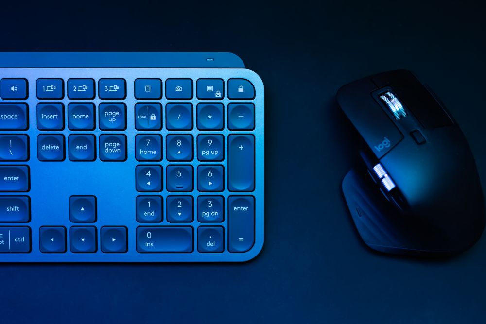
Control Unleashed: Voice, Taps, Blinks, and Beyond

If a website can only be mastered by nimble fingers and flawless speech, it’s left too many voices out in the cold. The 2025 standard is flexibility—a single form or menu can welcome typed phrases, spoken commands, onscreen button taps, even deliberate eye blinks tracked by affordable webcams.
Picture a software engineer in Cochin directing a billing page with whispered instructions while rocking a newborn to sleep, or a pharmacy student in rural Odisha advancing through clinical tutorials by simply blinking twice. Adaptive input becomes the norm. If one channel weakens—be it motor skills, speech, or sight—three others step up in support.
The interface is now the chameleon it should always have been—shapeshifting without complaint, never forcing a single “correct” way to act.
Authentic, Localized Content for Every Tongue and Story
Last, but far from least: content is reborn for context and diversity. Automatic translation relies less on robotic substitutions and more on genuine, community-powered adaptation. This means headlines ring true in Nepali and Marathi, while pop-up help tips fit the idioms of São Paulo or Casablanca. Holidays, humor, and even keyboard layouts are presented in ways that feel like home.
Accessibility is not just about removing obstacles; it is about celebrating local expression. A Bangalore schoolchild, a Cairo artist, and a Toronto retiree each see their own world reflected in the navigation, imagery, and cues of the same web platform—without anyone forced to peer through a foreign lens.
Review these practices, and something becomes clear: website accessibility in 2025 is not about ticking compliance boxes or perfecting code snippets; it is an ongoing choreography between technology’s latest and the unrepeatable patterns of human behavior.
Just like no two people are the same, websites are starting to adapt to each of us in their own unique way. They’re becoming smarter—adapting to who we are, where we are, and what we need in the moment. From language preferences to device responsiveness, every click now feels more personal. It’s no longer about just looking good—it’s about feeling just right for every user.
Do write to us with your questions or any business requirements and we will be happy to start the conversation. Send your queries to: contactus@panalinks.com